Transforming Nexyte's Style Guid to Scalable Design System


My Role
The Team
3 Product deisgners
5 PMs
1 R&D team lead
Key Contributions
Expanding color pallete
Setting global variables
Tokenization of varaibles
Building components
About Nexyte by Cognyte
Cognyte develops decision intelligence solutions for government and enterprise organizations worldwide, helping accelerate data-driven decision-making through advanced analytics and AI.
Nexyte is Cognyte's primary platform, combining and analyzing various data sources to make AI accessible to all users for investigations, security, and fraud detection.
Main Challenges
1
Broken design files that couldn't be used
2
Inconsistent interface patterns across the platform
3
Insufficient style guide for a complex enterprise product
4
Pressure to deliver new screens quickly while fixing existing problems
Our Approach
Atomic design approach - foundations first
We adopted atomic design methodology by starting with atoms (foundations). We analyzed existing screens and mapped all foundational elements: colors, typography, icons, spacing, paddings, sizes, radiuses, strokes, and elevations.
We followed Material Design guidelines, as it was used by the developers and it helped us boost our work.
Our build sequence:
Foundations - Atoms
Global design tokens and basic elements
Components - Molecules
Buttons, badges, input fields with properties and variants
Patterns - Organs
Complex components built from smaller components
Foundations - Atoms
Colors
Initially, there were only brand colors, but when we went through the product's screens, we noticed there was a use of a broader range of hues, especially in statuses and visualizations.
In addition, there was no semantic coloring for components and no clear guidelines on when to use each color.
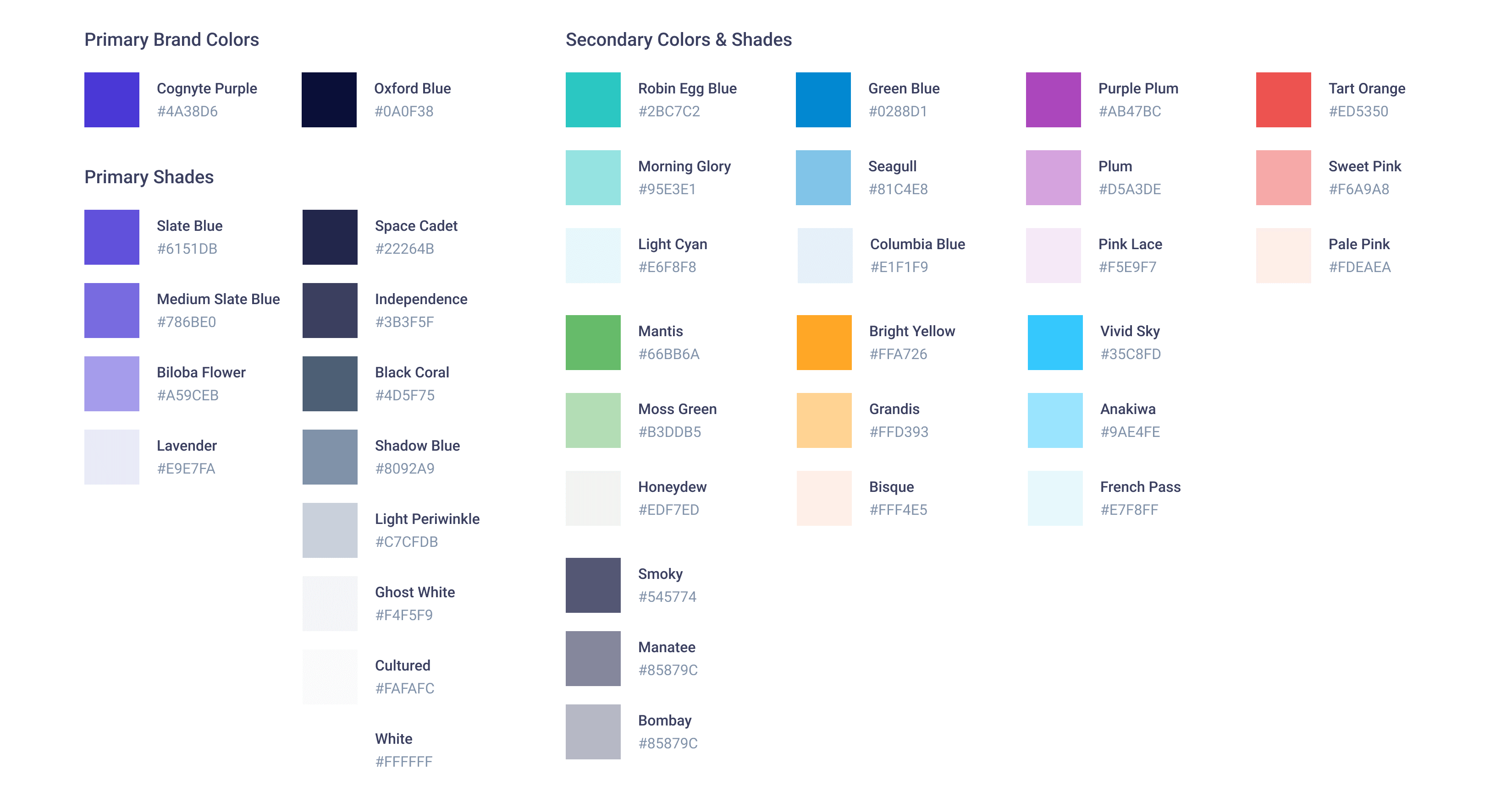
Thus, we created a full color palette for every brand color, so we could set clear guidelines for us and for the devs, to use in the product.
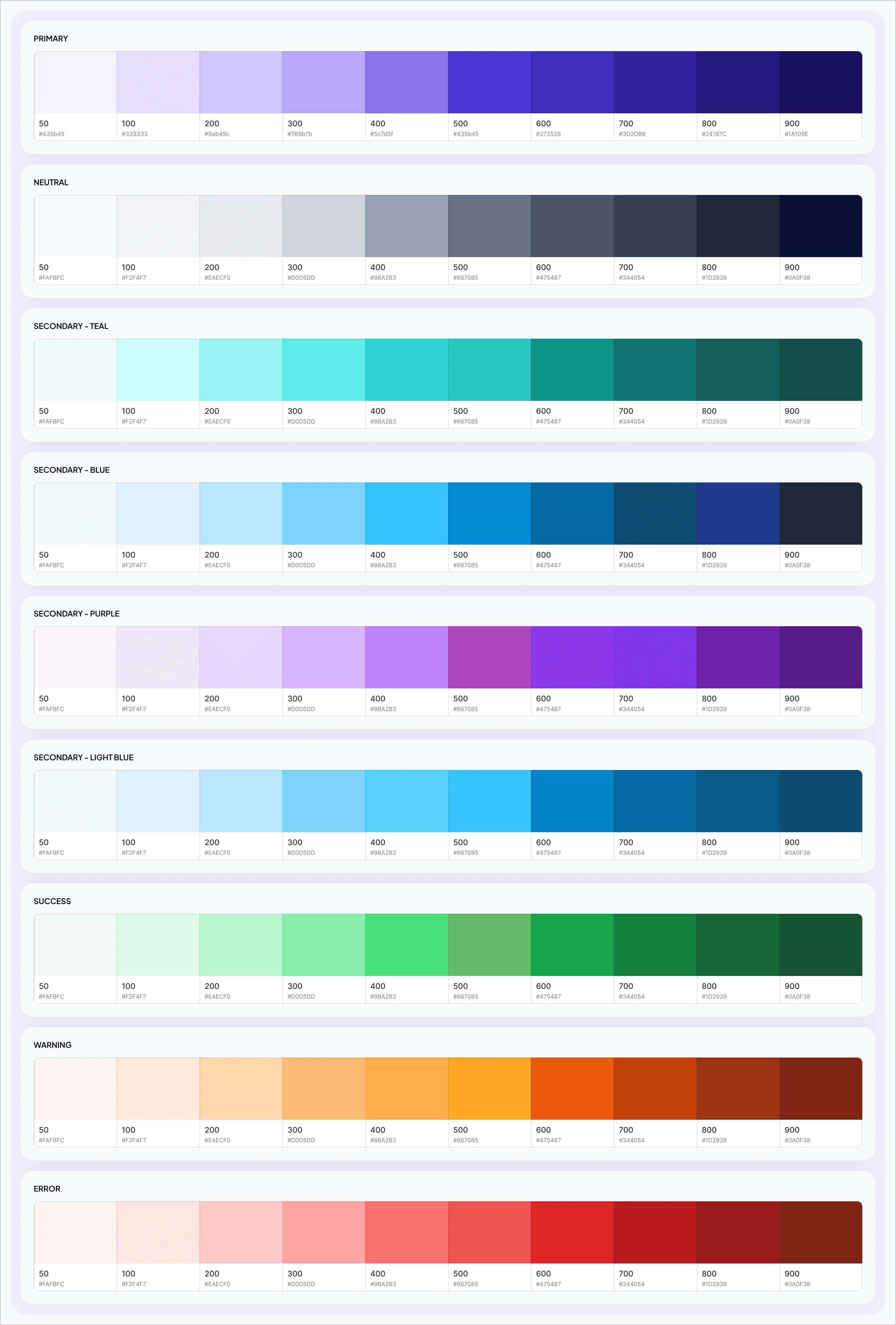
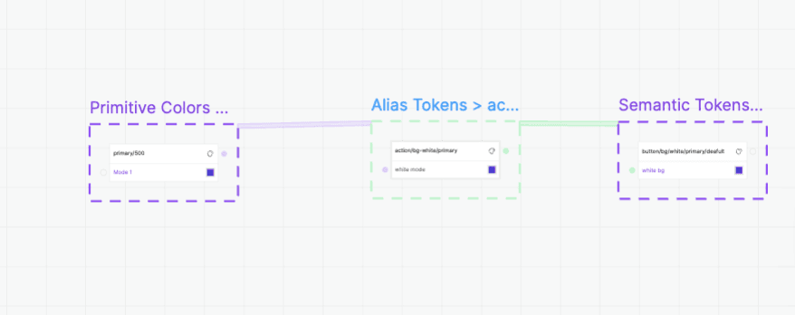
To organize the work with the devs to clarify when to use each color, I created a cascade variables format with 3 levels:
Primitives - Are the basic level of color values and contain the hex code of each hue and color. They are stricked and not used directly in the product.
Alias - a midway level, which helps to define broad coloring for common behaviors in the system, such as states (hover,disabled, etc…), backgrounds, texts and statuses. Are consisted from the primitives
Semantic - Variables which are used to specific elements of specific components. They are the used directly in the product and named after the component-element-state.

Typography
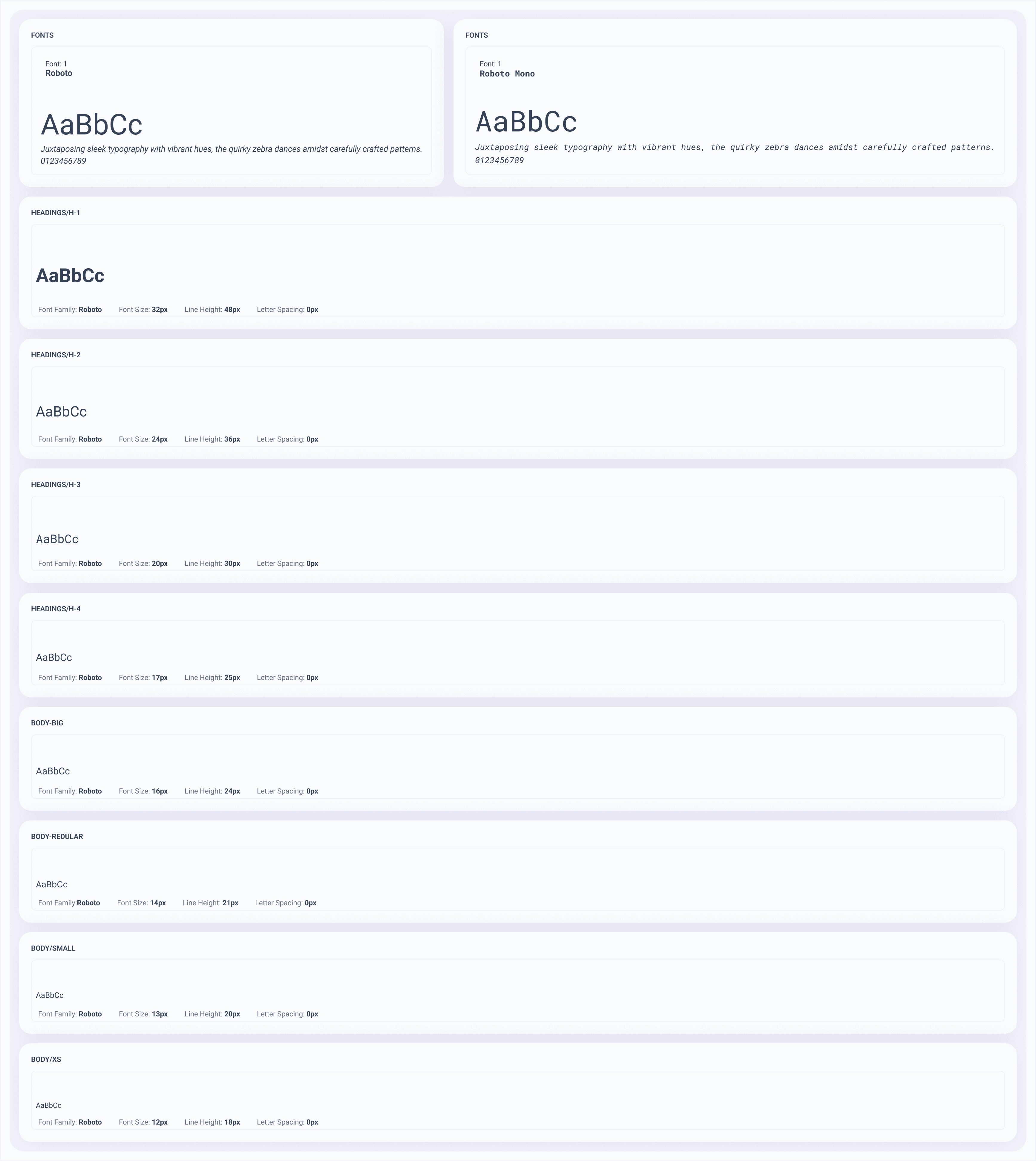
While mapping the product, I discovered a big veraity of text sizes, and unclear guidelines there usage. Never the less, the sizes scales was inbalanced.
So we collected all the text types we found, and ordered them according to size and weight. I continued the use of Roboto, as it was clear, simple, and legible.
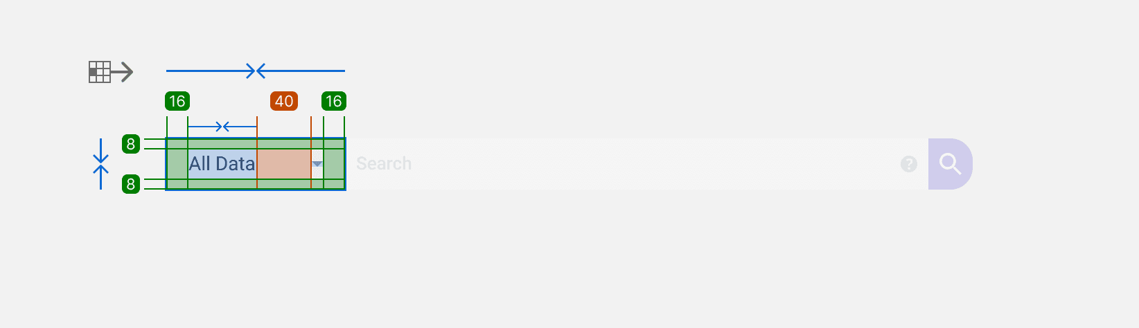
Spacing, elevations, Border Radius & Strokes
Also, here, there were no clear guidelines, so I created another collection called Global Variables, which contained the basic values for these elements.
After defining the basic values, I created semantic variables for these elements, relying on the globals, such as:
Button-paddings-small

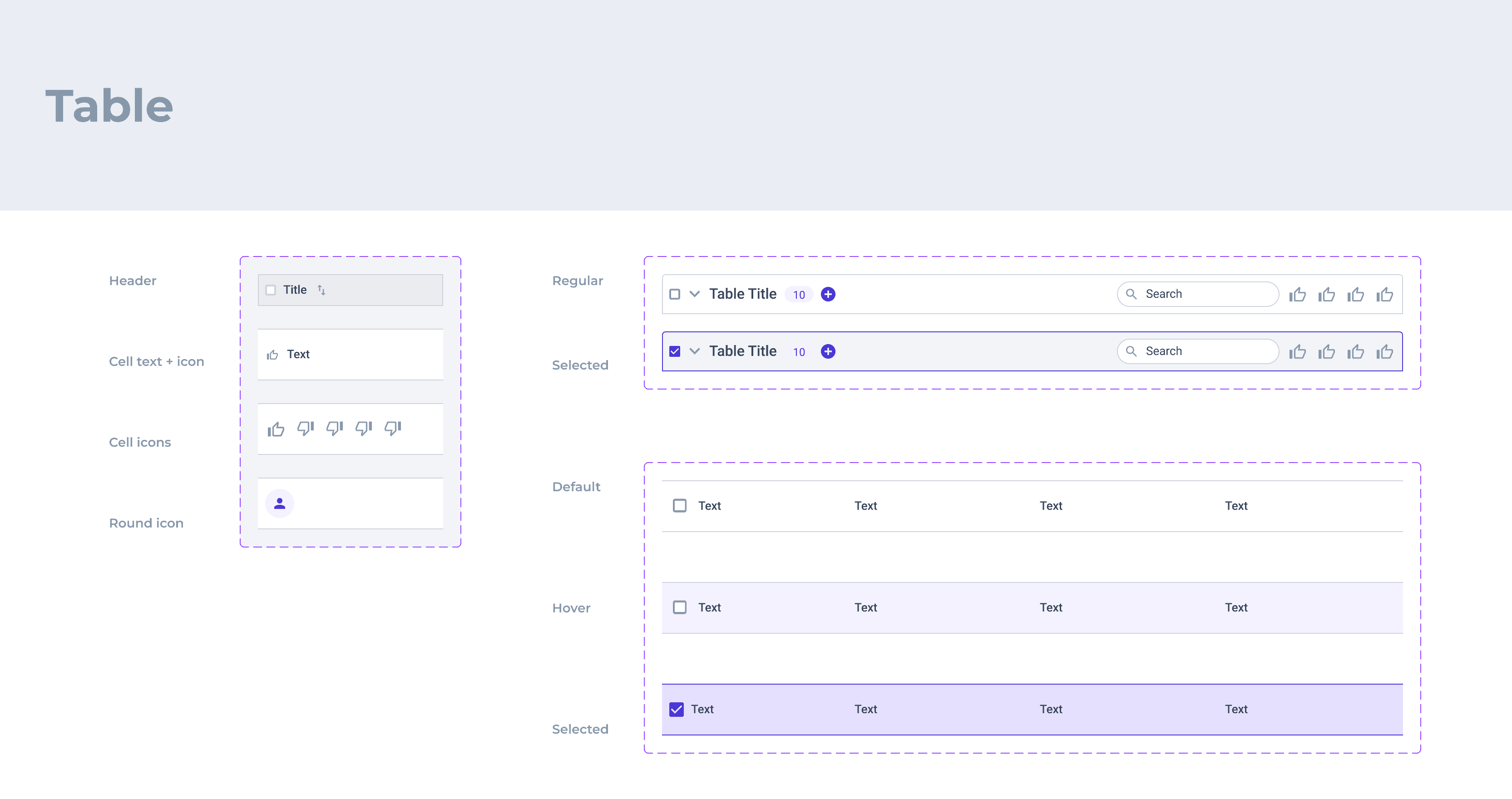
Components - Molecules
Buttons
When I approached the buttons, I discovered that the white button was created for dark headers that clashed with the existing secondary buttons on bright backgrounds.
Due to PM's insistence on keeping the shortcut button and time constraints, we preserved the problematic button, but I added primary and tertiary variants for dark backgrounds to prepare for future dark surface use.

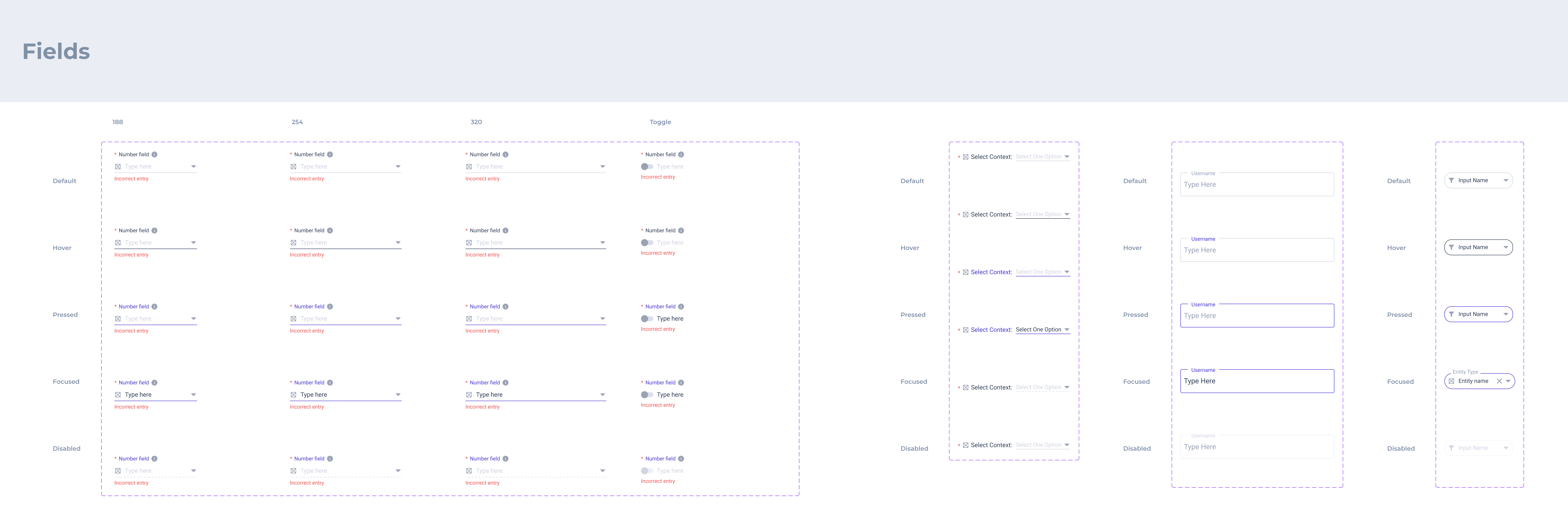
Input Fields & Input Elements
Afterwards, we continued to adjust more components to the new variables. Text fields had a variety of patterns and a lack of consistency, but they all stand in Material design guidelines, so at this stage, I just collected them and noticed, for future opportunities to replace and align consistency in this aspect.

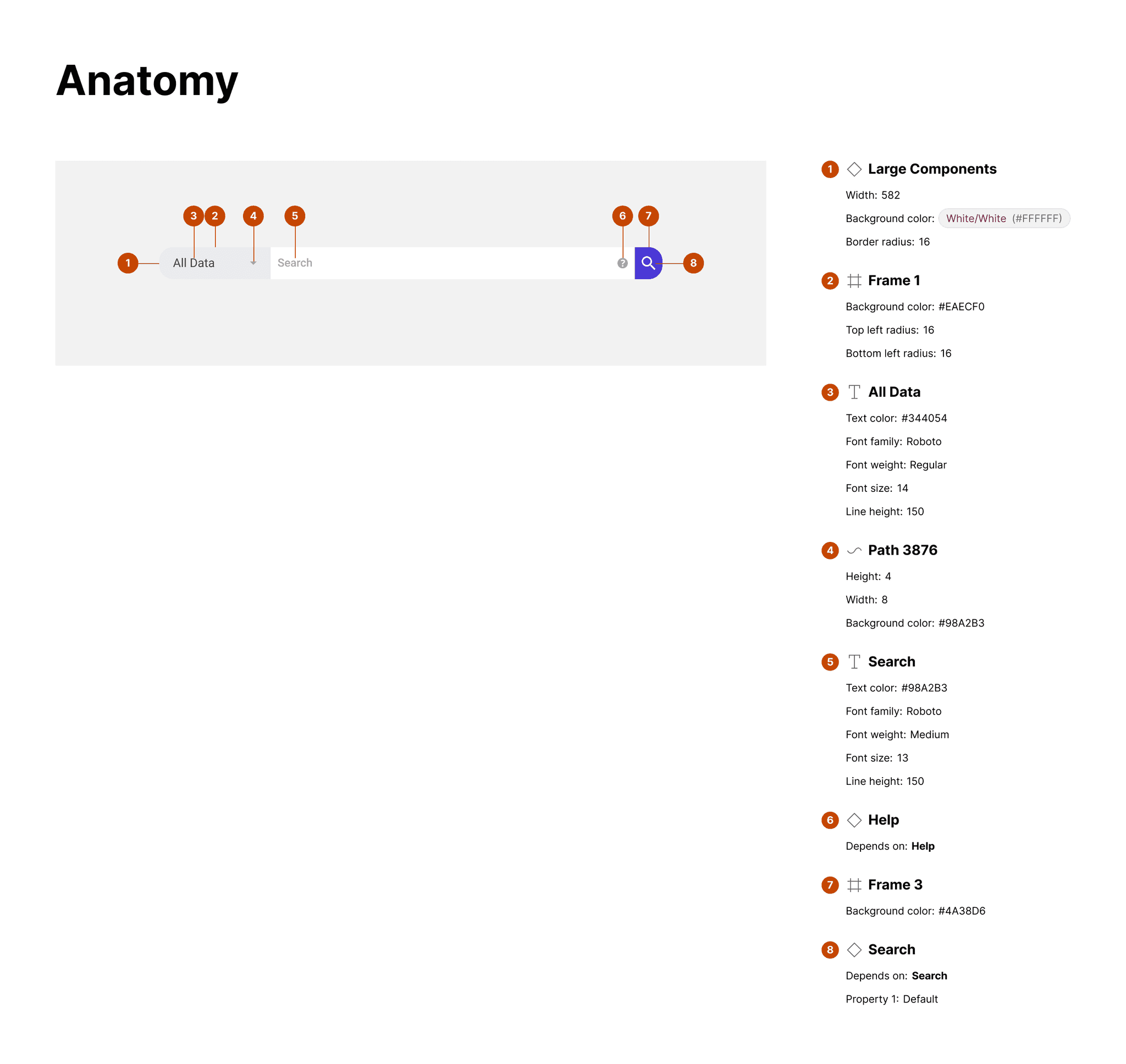
Patterns - Organs
Building Components
Eventually, after we set the foundations and basic components, we could build the existing components faster at scale. By that, we completed the re-construction of the design system and could continue design new features fester and accurate.