Product Designer
User Interviews
Competitive Analysis
Design
Prototyping
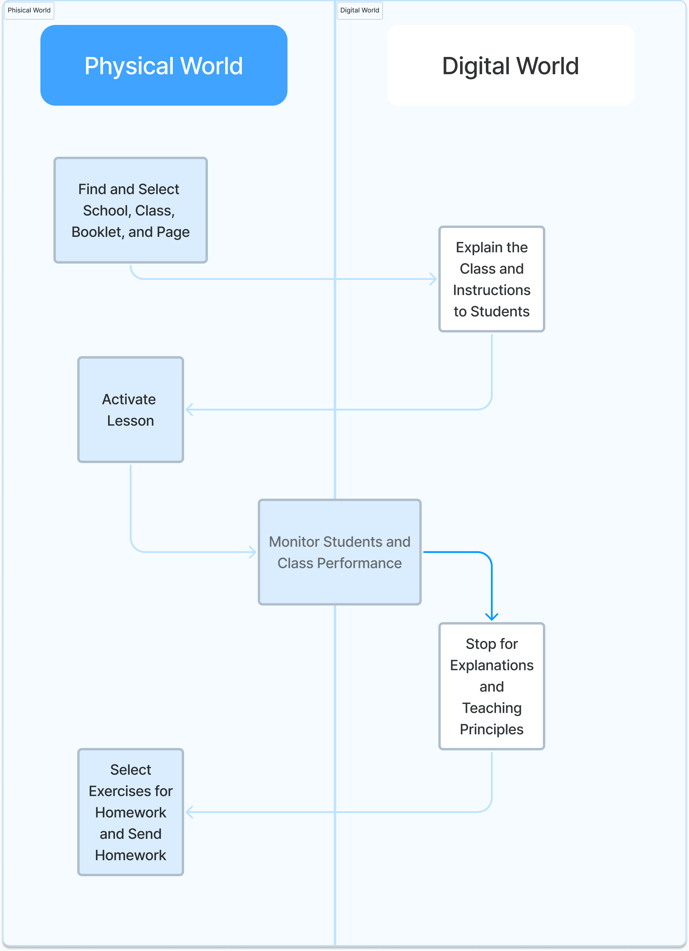
Product Context
Main Challenges
1
Transitioning paper to online
with minimum method adjustments
2
Hybrid Experience
Connecting Phisical and digital experiences
3
Multiple Personas
Diverse age groups of students, and teachers
What Are The Product's Goals and Objectives?
Users & stakeholders interviews
Main Takeaways & Insights
Which features similar products have? and how do they look like?


Verity of actions and interactions
Easy to find and varied the tool bar
Unnecessary action which can adds clutter to the screen and burden the student select one
Easy UI and UX for opening a class and integrative to other software such as google classroom.
Who are our potential users?
Teacher

High School
Student
Elementary
School
Student


Information hirerchy and architecture
How the users will interact and use the product?
As the class experience involve physical and digital realms, every task for each user group follows a distinct path, even though several paths involve both.
From Research To Design - Inital Wireframing
Finalizing Design - Studet's High Fidelity Screens
Main Screen
Navigation - The student can navigate threw tools from the tool Icon and inside the tool pages from the page header.
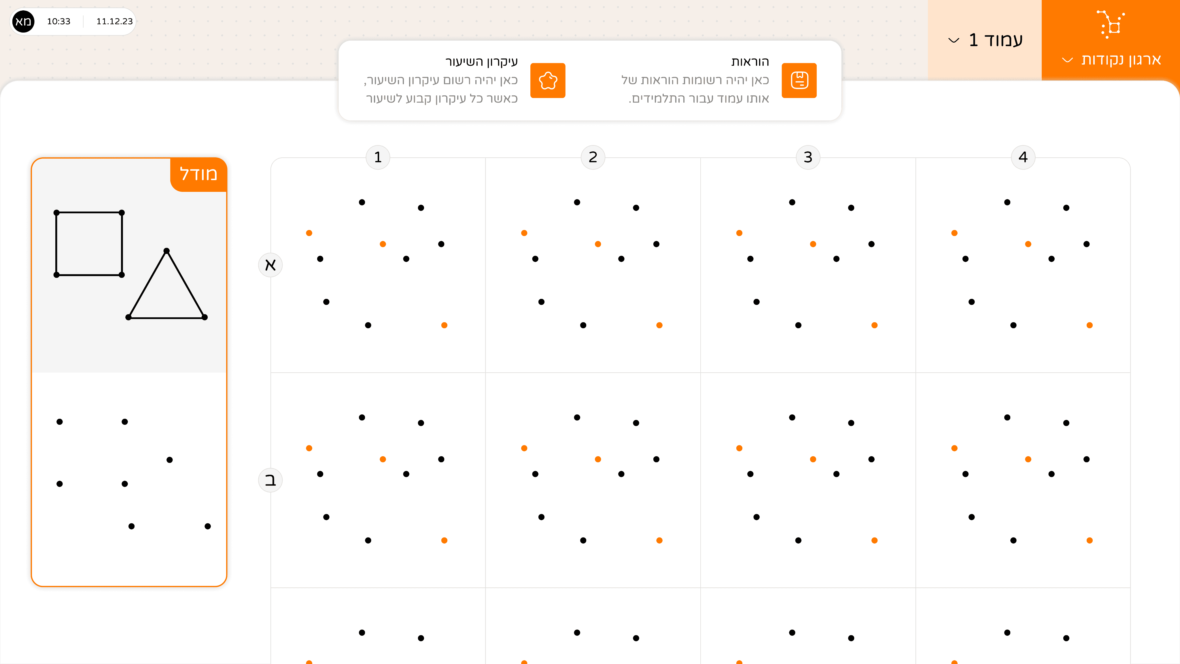
Connecting dots tool - High fidellity UI
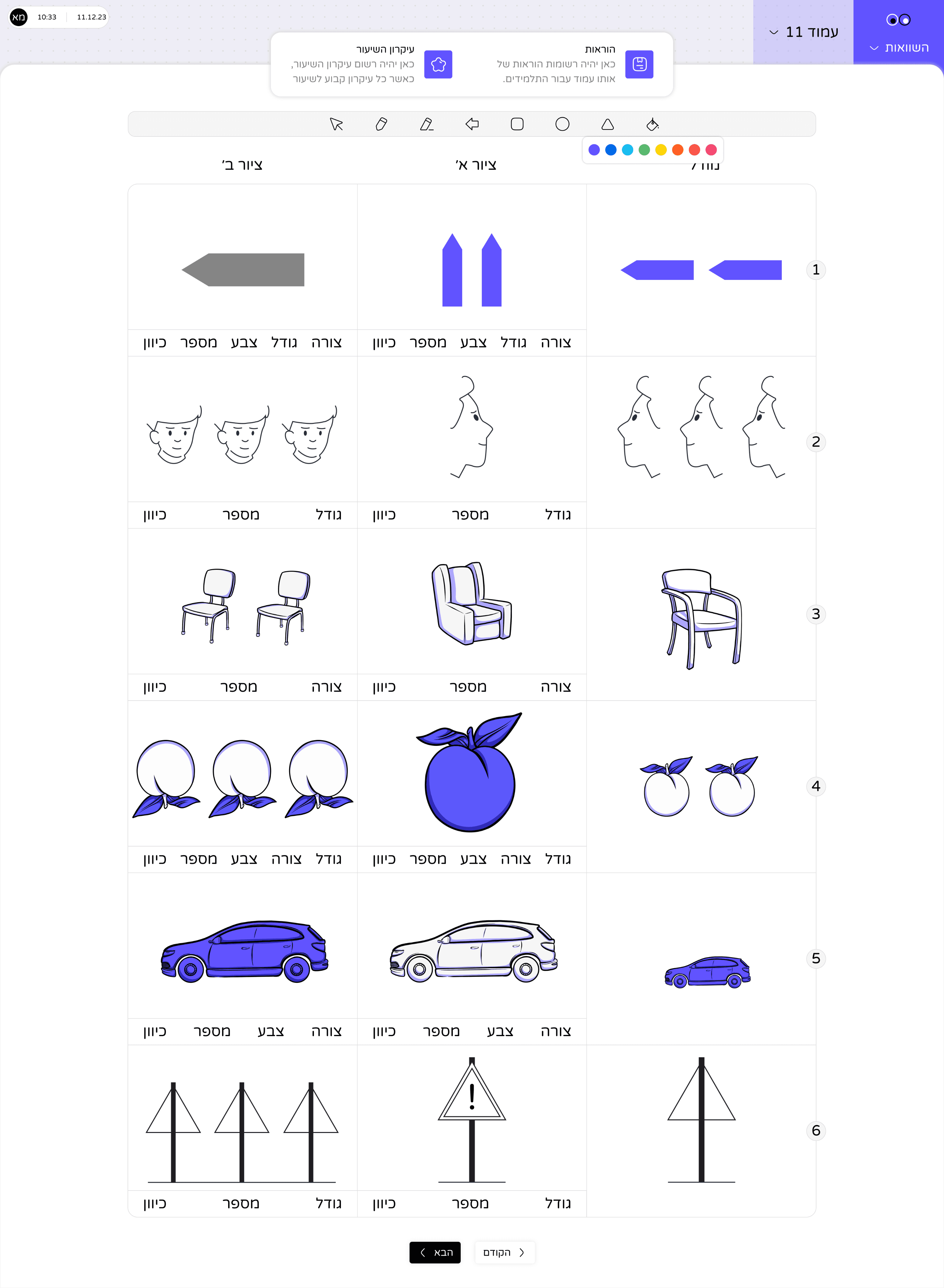
Comparisons tool
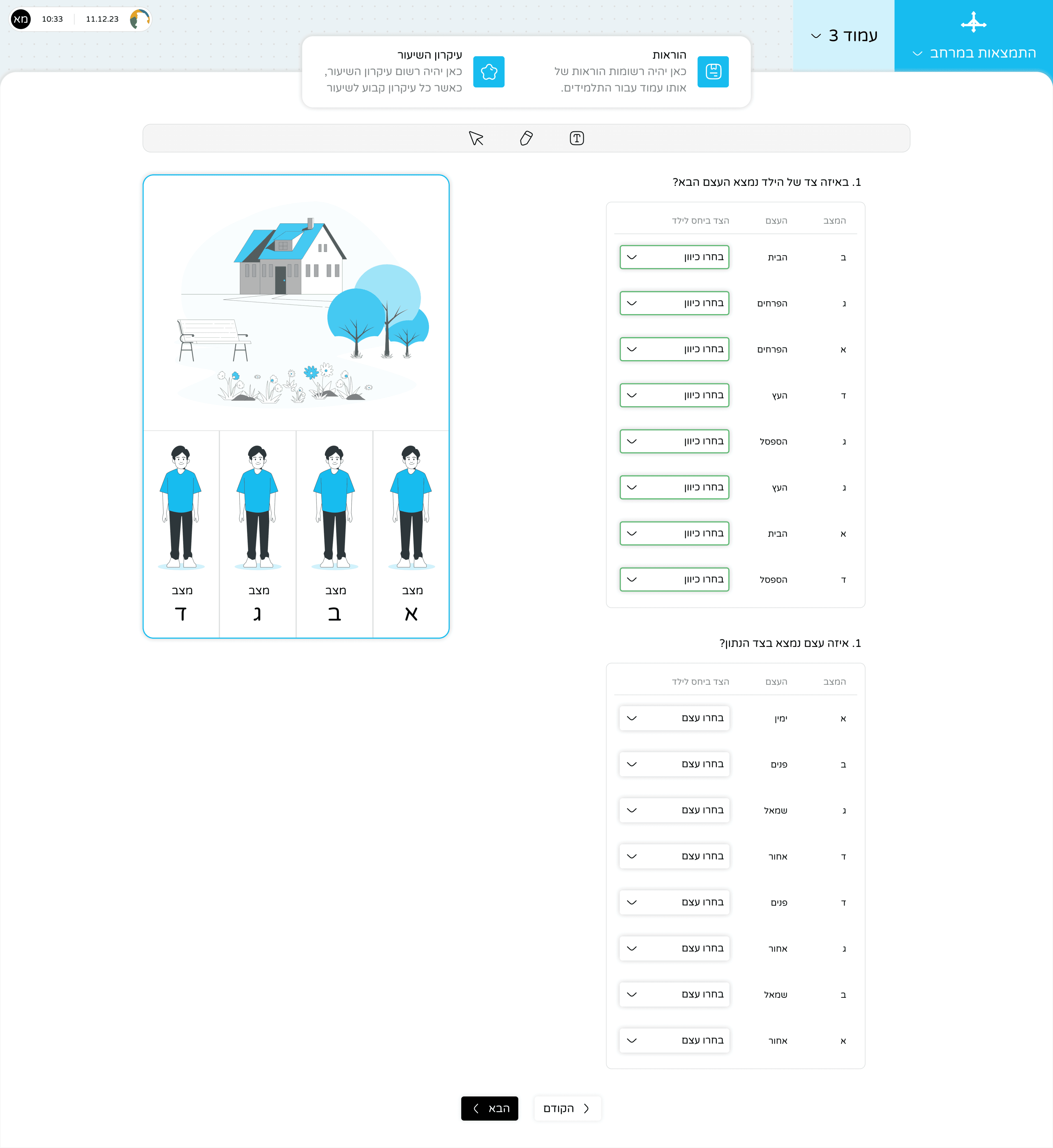
Orientation in space tool
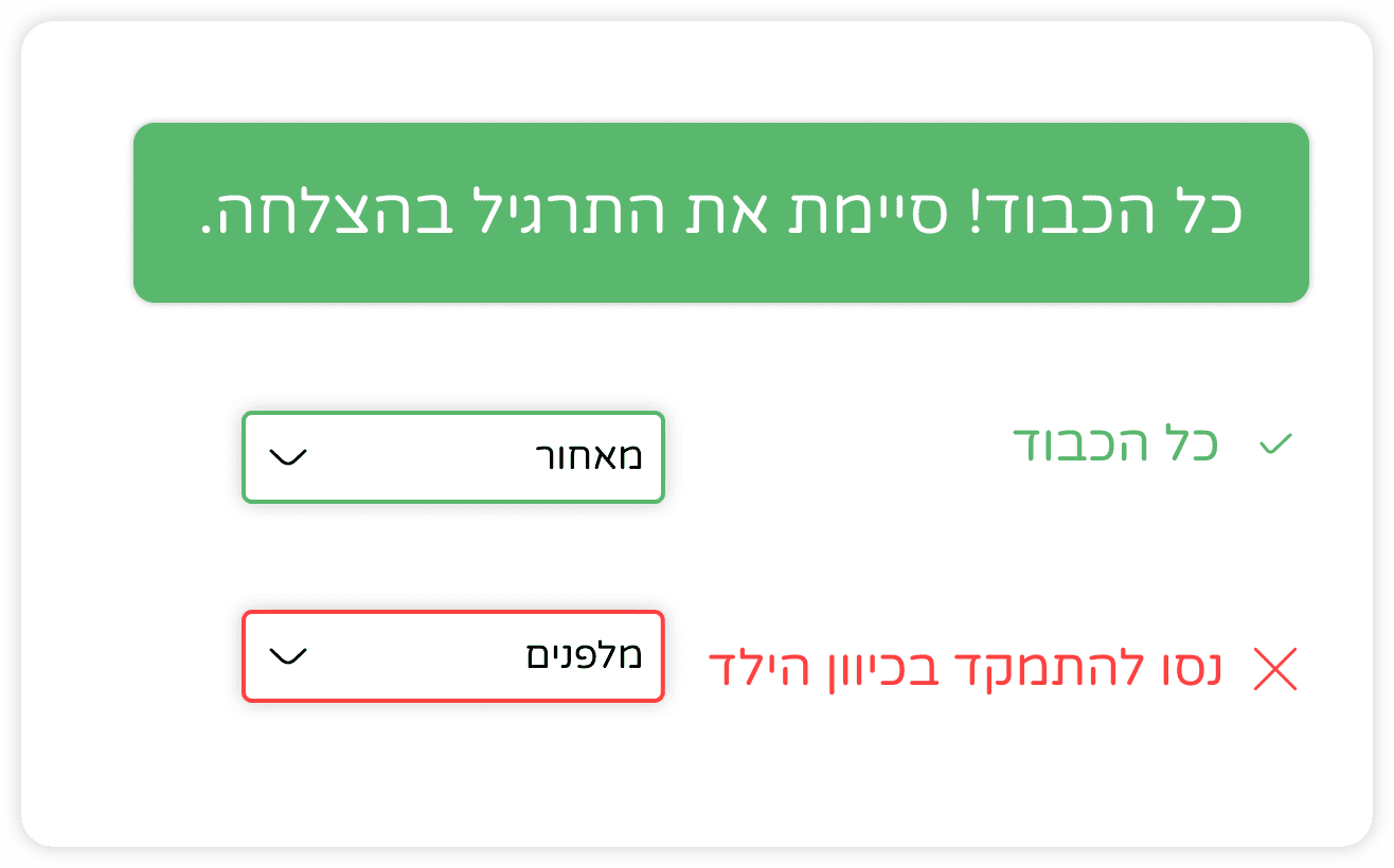
How might we design thoughtful & efficient feedback expereice?
Finalizing Design - Teacher's High Fidelity Screens
Add New Class
Manage Live Session
Manage Home Work
Testing The Produc'ts Usabillity
Test teacher’s Flows Select a class and play
Improve user experience before developing
Improve user experience before developing
Add a new class
Select a class and play
Give homework
Check Homework
Find the form
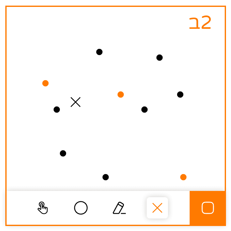
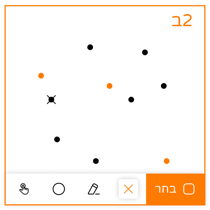
Mark the dot
Eliminate dote
Point the error
2 Teacher
5 Students
🧪 Type
Task Success
Expressions
Difficulties
How well did they perform the tasks?
Teacher
Add a new class
Select a class and play
Give homework
Check Homework
Student
Find the form
Mark the dot
Eliminate dote
What we discovered on teachers and how we solved it
List Comprehension
Progress bar
Teachers found it hard to understand the exact student location, so we switched to steps and non-non-linear bars.
Open details button
Teachers didn't notice the interaction of "click-a-row-to-open-details", so I added a fixed button for every row, to be explicit action.


Homework Location
In the first version, the homework location was outside of the current class. As a consequence of the confusion it made, we positioned it inside the current class, at a side panel.

Square Actions
Elimination Mark
The elimination mark was shown near the dot, but that confused the users, so we shifted to be on the dot.